The Coal Office; a holistic experience
Against an industrial backdrop, Tom’s Dixons new HQ, The Coal Office, leads the way as a multi-disciplinary space for innovation in design.

A fresh London home for Tom Dixon’s latest experiments, innovations and collaborations.
The Coal office is designed to push the boundaries of contemporary retail as we know it.
Later this month, the internationally renowned brand Tom Dixon opens it's doors to the design brands most ambitious development yet. Located in the heart of London’s Kings Cross, the new hub contributes to an ever-expanding network of creative businesses within the area. We were lucky enough to be invited to a private press-preview this week, for a first look at how the space has been transformed...
“For us it was imperative not just to find a new office or shop. It was vital to find a new home. London isn’t just another city. It is where it all started. We will use these 17,500 square feet in this incredible location as a platform to broadcast our latest ideas in interior design, product innovation and experiments in food, functionality and future living.”
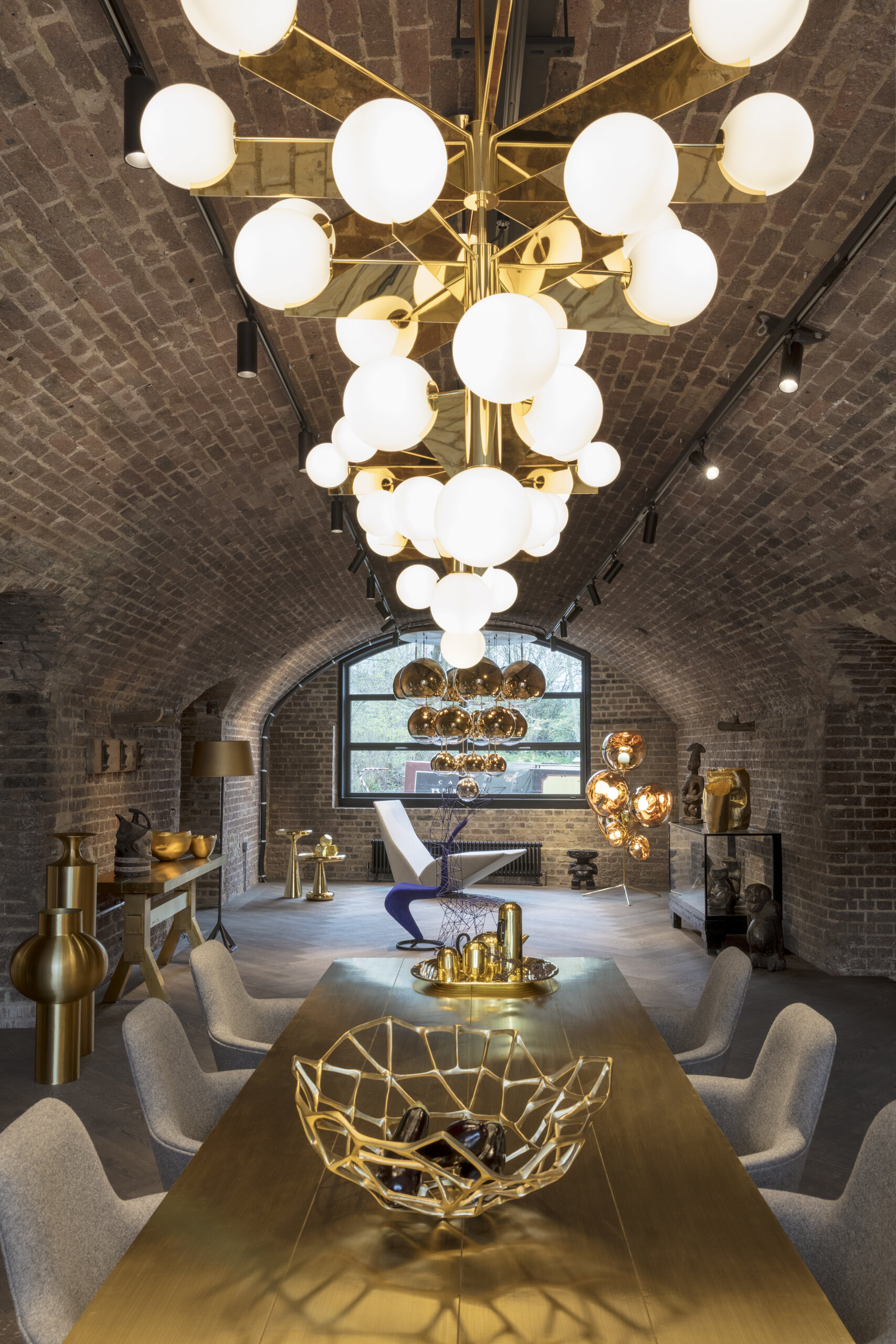
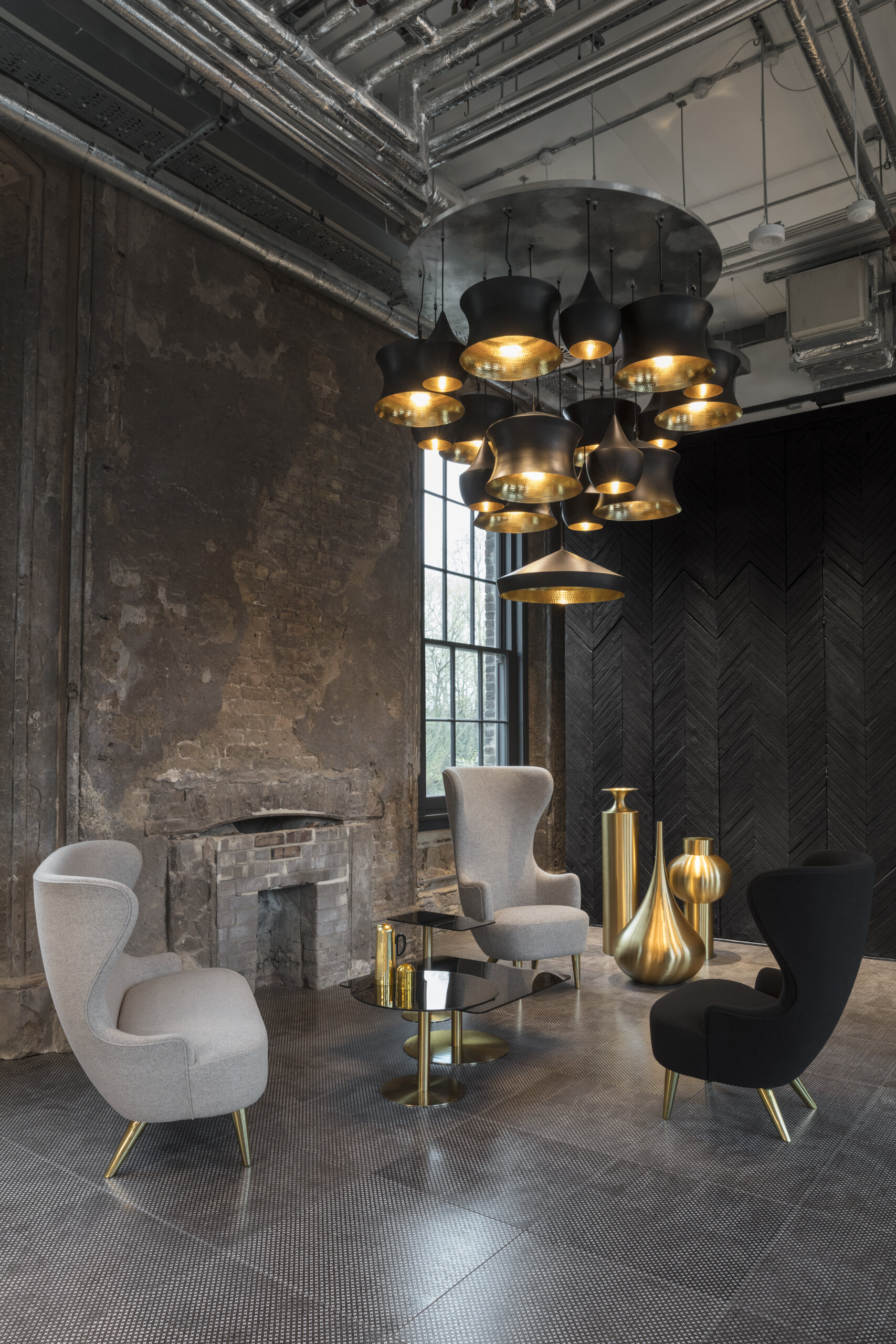
Against an industrial backdrop the Coal Office is set to lead the way as a multi-disciplinary platform for innovation in design. The space will function as a live studio combined with a gift-shop, workshop and office all under one roof, with the culinary delights of a brand-new restaurant and roof terrace - to be launched later in the year, towards the end of June.
The Coal Office will serve as the ultimate centre for interiors, a journey through outstanding details from beginning to end. The lower ground store and showroom is a sensory journey, something which the iconic buildings architecture naturally lends itself to. A series of large archways split the space, allowing each sensory element to shine individually whilst harmoniously flowing into one another through the continued details of exposed brickwork and large-scale hardwood floors.
Each individual archway and the sensory visions of light, colour, tactility and scent within it, are all carefully considered in the new premises which notably isn't named after the Tom Dixon brand itself; a conscious decision to allow each element to breathe with room for creative collaborations from younger craft studios and complementary businesses; hand-selected for cohabitation by Tom Dixon personally.
In celebration of the unique history of the building, which dates back to 1851, edible installations celebrating the power of coal by food concept studio Arabeschi di Latte were served on the day, along with new product presentations and a tour by the designer himself. To preview the emotionally considered space before it opens to the general public at the end of this month, head over to our Instagram account here.
Opening Dates and Times
Shop Opening Date: Friday 20 April, Monday - Saturday 10am – 7pm, Sunday 11am – 4pm.
Restaurant: Opening late June 2018.
Address: Tom Dixon, The Coal Office, 1 Bagley Walk, London N1C 4PQ


Curating colour for a home that will nourish your soul
Intelligent design harnesses the power of colour, forming a balance between visual-aspirations and nourishment of the soul; for a purposeful, passionate and peaceful life...

Acknowledging the power of colour, and it’s perhaps unexpected connection to our emotions, allows us to realise its full potential.
The impact of colour on our daily lives is often instinctive, subconscious and undoubtedly emotive, but why?
Colour, put simply, is energy formed from light of varying wavelengths. Each colour is materialised by its own unique wavelength and therefore unique energy; each impacting our visual senses significantly.
Dating back thousands of years chromotherapists, or colour therapists, have been known to harness colour and its energy holistically, utilising it as a non-invasive and powerful therapy for finding balance and harmony; positively affecting both the mind and body. Each colour is thought to hold its own benefits based on where they appear within the visible spectrum. Cooler colours red, orange and yellow are located at the top of our visual spectrum, providing stimulating effects. Red, activates and revitalises, orange holds the power to restore whilst yellow fortifies and brightens our inner-self. Lowest on the visual spectrum are the warmer colours, providing calming effects; blue soothes and relaxes, indigo provides purity and focus and violet is there to inspire and support us. Green is located in the middle of the warm and cooler hues, it's power considered a great balance force, harmonious by nature much like nature itself.
How we view colour and its effects should be something we carefully consider, utilising these hidden powers to create the specific mood or feeling required from a space, a mindful masterpiece if you will. The balanced and relaxing nature of green for example would be ideal for living or bedroom spaces whilst blue is possibly more ideal for creating a soothing atmosphere in a luxury bathroom.
White contains all the colours within the visual spectrum, emphasizing purity and providing clarity to our thoughts. This could be the reason why white is so prevalent in Scandinavia, home to some of the best furniture and product designers in the world who apply a heightened level of detail to their considered and simplistic pieces.
Recently however a notable shift has formed within Scandinavian culture with an evident increase in stronger, bolder hues being adopted. Their love of classic pieces of furniture and lighting and their ease of access to it has uniquely allowed them to experiment with colour without the need to redesign their space from scratch. They are able to change the mood of a space using just colour, compensating for the harsh meteorological seasons that dictate their daily lives, whilst incorporating consistently their classic items of furniture. Short days during the winter season force Scandinavians to constantly seek light, in contrast to the summer months where the days draw-out long into the night. A simple refresh of paint work at home can be used easily to balance this, creating interior harmony that doesn’t continually exist outside.
Quality in the colours used is equally important. Here at Rachel Usher Interior Design we regularly use British paint manufacturer Little Greene, who offer luxury paints whilst remaining committed to socially and environmentally responsible production. For commercial projects Paint and Paper Library is our brand of choice; their paints officially accredited by the Royal Institute of British Architects. Both brands are available to order and collect from our Bawtry Interior Design Studio in Doncaster, if you’re in need of some sage advice selecting colours however, please do get in touch before visiting us.
Whilst our reactions are instinctive to colour based on their unique wavelengths and energy, curating colour combinations can be particularly difficult to navigate. We're proud to offer a colour consultation service, approaching colour in a way that’s personalised to you, informing the mood of your space and ultimately nourishing your soul.